library("readr")
library("dplyr")
library("lubridate")
library("tidyr")
library("ggplot2")Infovis 2: Exercise A
For today’s exercise, you will need the dataset temperature_2005.csv (InfoVis2). This dataset contains temperature readings from various weather stations, this time from the year 2005. The date is formatted in such a way that R (specifically read_delim) should correctly recognise it as datetime and read it as POSIXct.
temperature <- read_delim("datasets/infovis/temperature_2005.csv", ",")Task 1
Transform the wide table into a long table using the following code.
temperature_long <- pivot_longer(
  data = temperature,
  cols = -time,
  names_to = "station",
  values_to = "temperature"
)| time | station | temperature |
|---|---|---|
| 2005-01-01 | ALT | 1.3 |
| 2005-01-01 | BUS | 1.5 |
| 2005-01-01 | GVE | 1.1 |
| 2005-01-01 | INT | 0.2 |
| 2005-01-01 | OTL | 2.2 |
| 2005-01-01 | LUG | 1.7 |
Next, import the dataset temperature_2005_metadata.csv and join the two datasets with a left_join via station (or stn).
Task 2
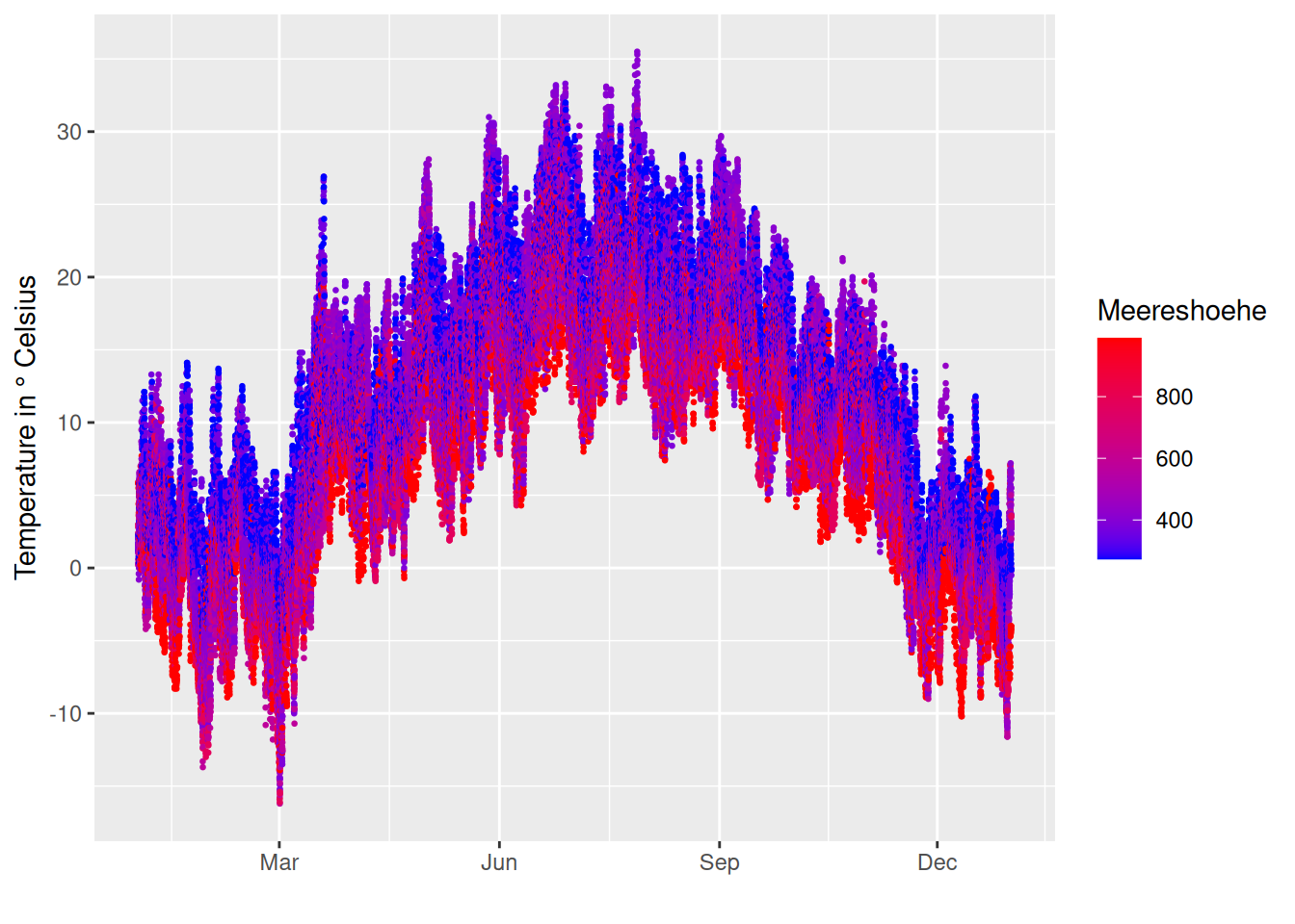
Create a scatter plot (time vs. temperature) where the points are coloured based on their sea level. Lower values should be coloured blue and higher values red (scale_colour_gradient). Reduce the size of the points to avoid excessive over-plotting of the points (size =). Furthermore, the respective month should be noted on the x-axis at intervals of 3 months (date_breaks and date_labels from scale_x_datetime()).
Task 3
Create an additional Date variable with the date of the respective measurement (with as.Date()). Use this column to calculate the average daily temperature at each weather station (with summarise()).
To keep the metadata (Name, Meereshoehe, x, y), you can perform the join from the first exercise again. Alternatively (faster but also more advanced), you can use these variables within your group_by.
Task 4
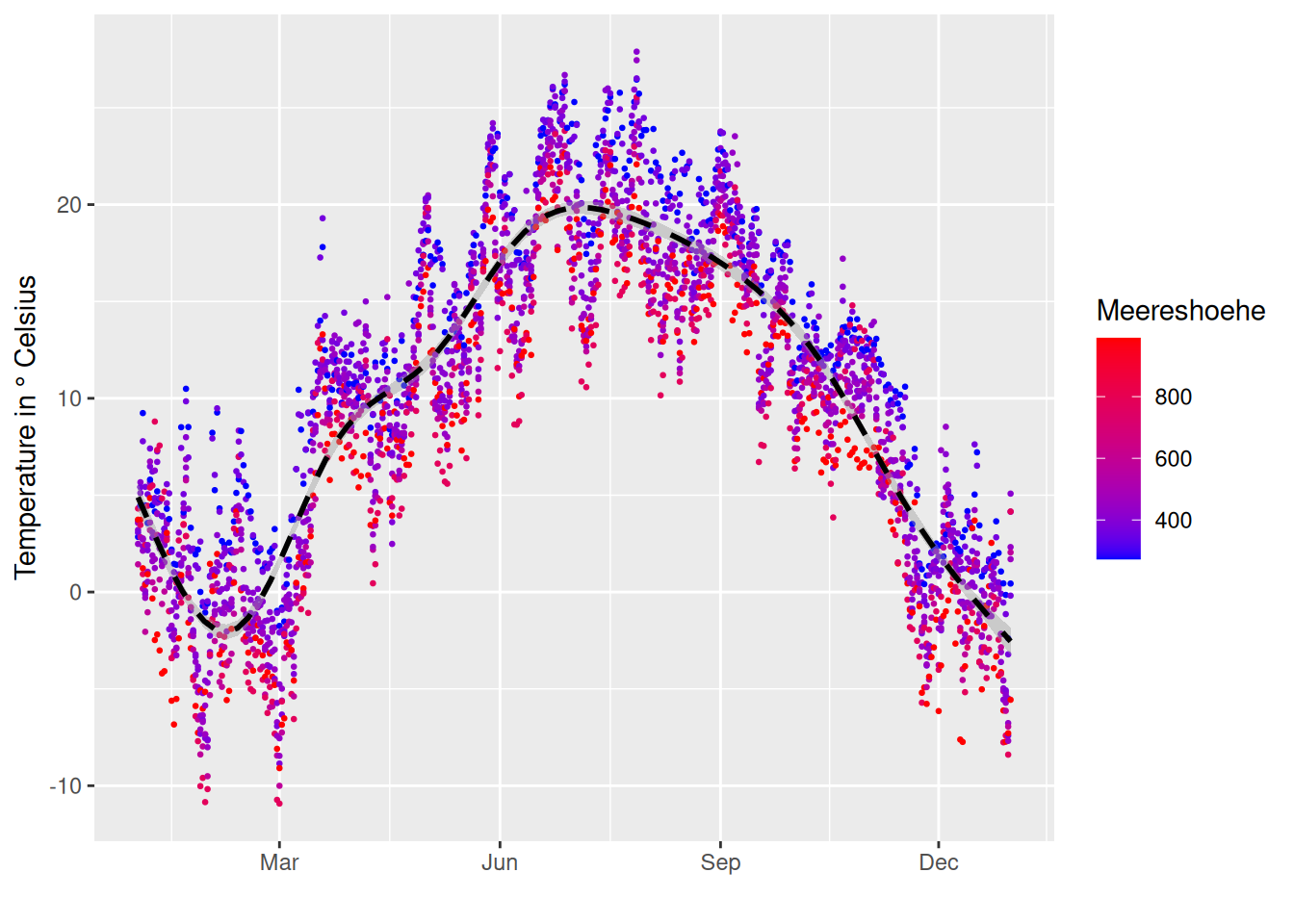
Now repeat the plot from the first task with the aggregated data from the previous task. To set the labels correctly, you need to replace scale_x_datetime with scale_x_date.

Task 5
Add a black, dashed trend line to the plot above (geom_smooth()).
Task 6
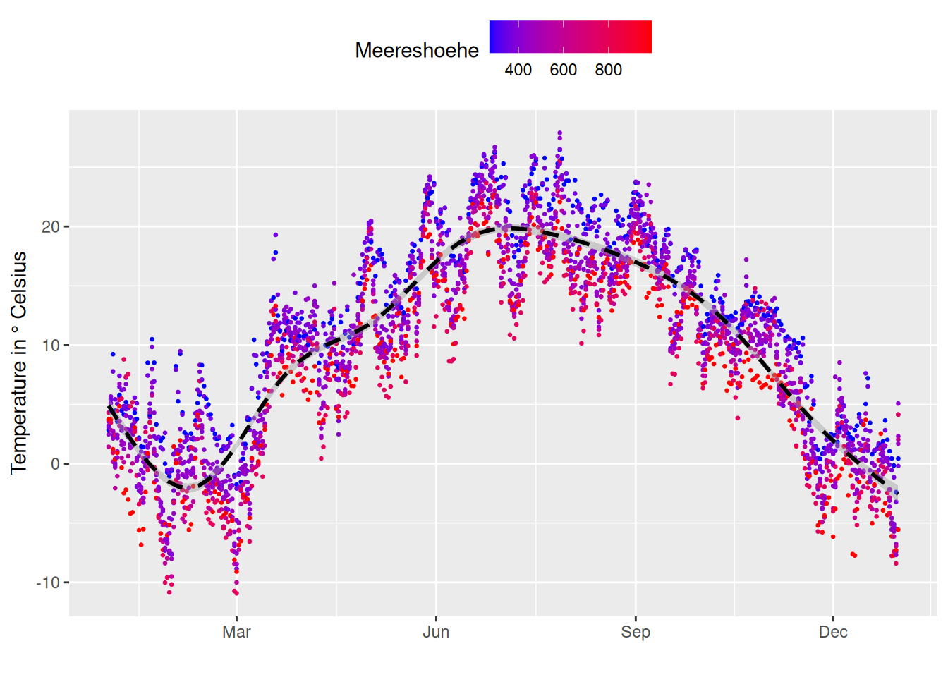
Position the legend above the plot (use theme() with legend.position).
Task 7
Now, let’s move away from the scatter plot and create a box plot with the temperature data. Colour the box plots again depending on the sea level.
Note the difference between
colour =andfill =Note the difference between
facet_wrap()andfacet_grid()Remember,
facet_grid()requires a period (.) next to the tilde (~).Note the difference between “
.~” and “~.” infacet_grid()Adjust the position of the legend as needed
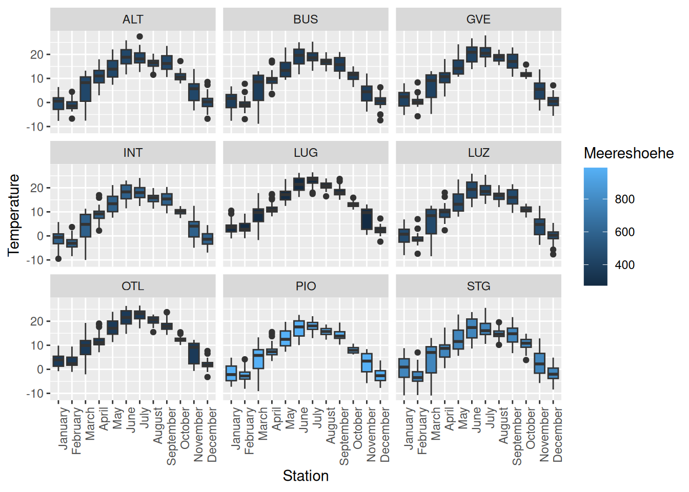
Task 8
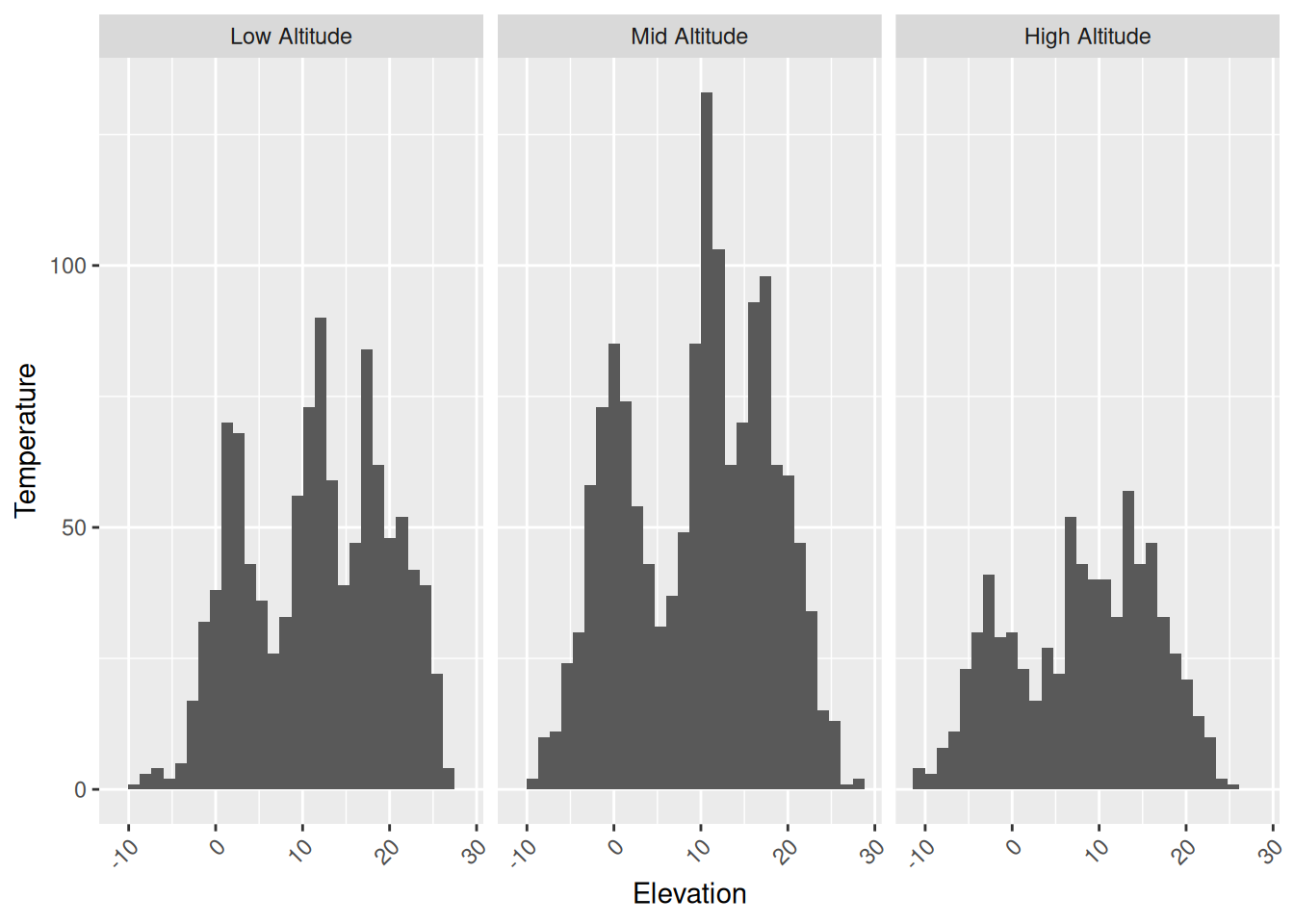
As a final important plot type, let’s complete two exercises with histograms. First, create a histogram geom_histogram() with the temperature values, then allocate the weather stations to different altitude levels (Low altitude [[< 400 m]], Mid altitude [[400 - 600 m]] and High altitude [[> 600 m]]). Finally, compare the distribution of temperature values at the different altitudes using a histogram.
Tip: Use cut to divide the stations into the three groups
