library("readr")
library("lubridate")
library("dplyr")
library("ggplot2")
library("tidyr")Infovis 1: Demo A
In this demonstration, we’ll start by loading the dataset temperature_SHA_ZER.csv, a refined version of the data from our previous lessons, PrePro1 and PrePro2. You can download this data from moodle: InfoVis1
temperature <- read_delim("datasets/infovis/temperature_SHA_ZER.csv", ",")| time | SHA | ZER |
|---|---|---|
| 2000-01-01 00:00:00 | 0.2 | -8.8 |
| 2000-01-01 01:00:00 | 0.3 | -8.7 |
| 2000-01-01 02:00:00 | 0.3 | -9.0 |
| 2000-01-01 03:00:00 | 0.3 | -8.7 |
| 2000-01-01 04:00:00 | 0.4 | -8.5 |
| 2000-01-01 05:00:00 | 0.5 | -8.4 |
Base-plot vs. ggplot
We can create a scatterplot in “Base-R” to compare dates and temperatures as follows:
plot(temperature$time, temperature$SHA, type = "l", col = "red")
lines(temperature$time, temperature$ZER, col = "blue")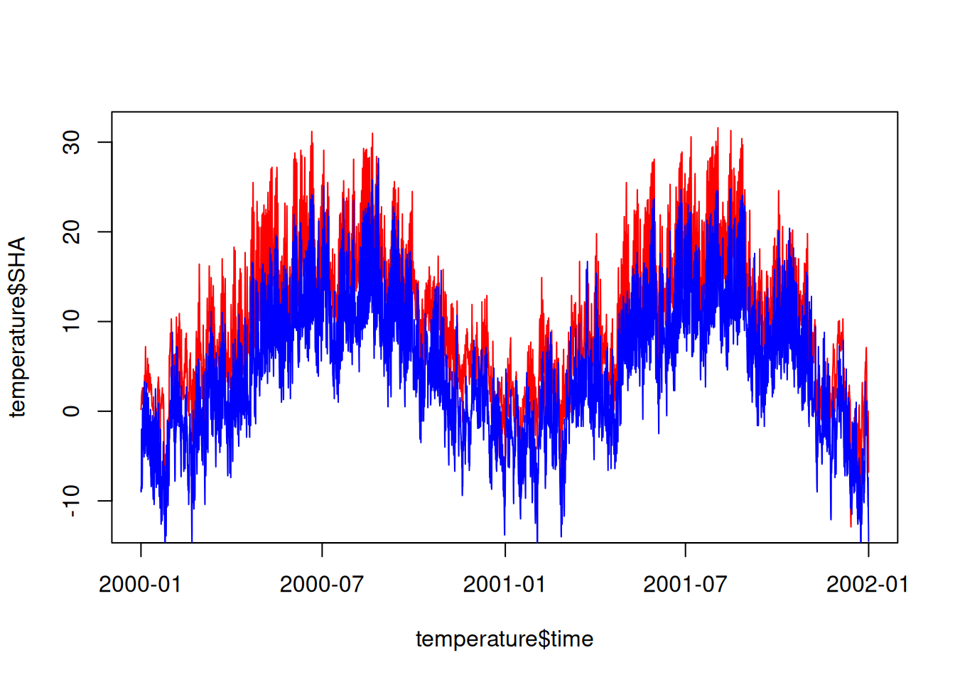
In ggplot, the approach is more nuanced. A plot begins with ggplot(). This command specifies the dataset (data =) and the variables within the dataset that influence the plot (mapping = aes()).
# Dataset: "temperature" | Influencing variables: "time" and "temp"
ggplot(data = temperature, mapping = aes(time, SHA))
In ggplot, at least one “layer” is required to represent data, such as geom_point() for scatterplots, using the + operator. Unlike “piping” (|>), a layer is added with +.
ggplot(data = temperature, mapping = aes(time, SHA)) +
  # Layer: "geom_point" corresponds to points in a scatterplot
  geom_point()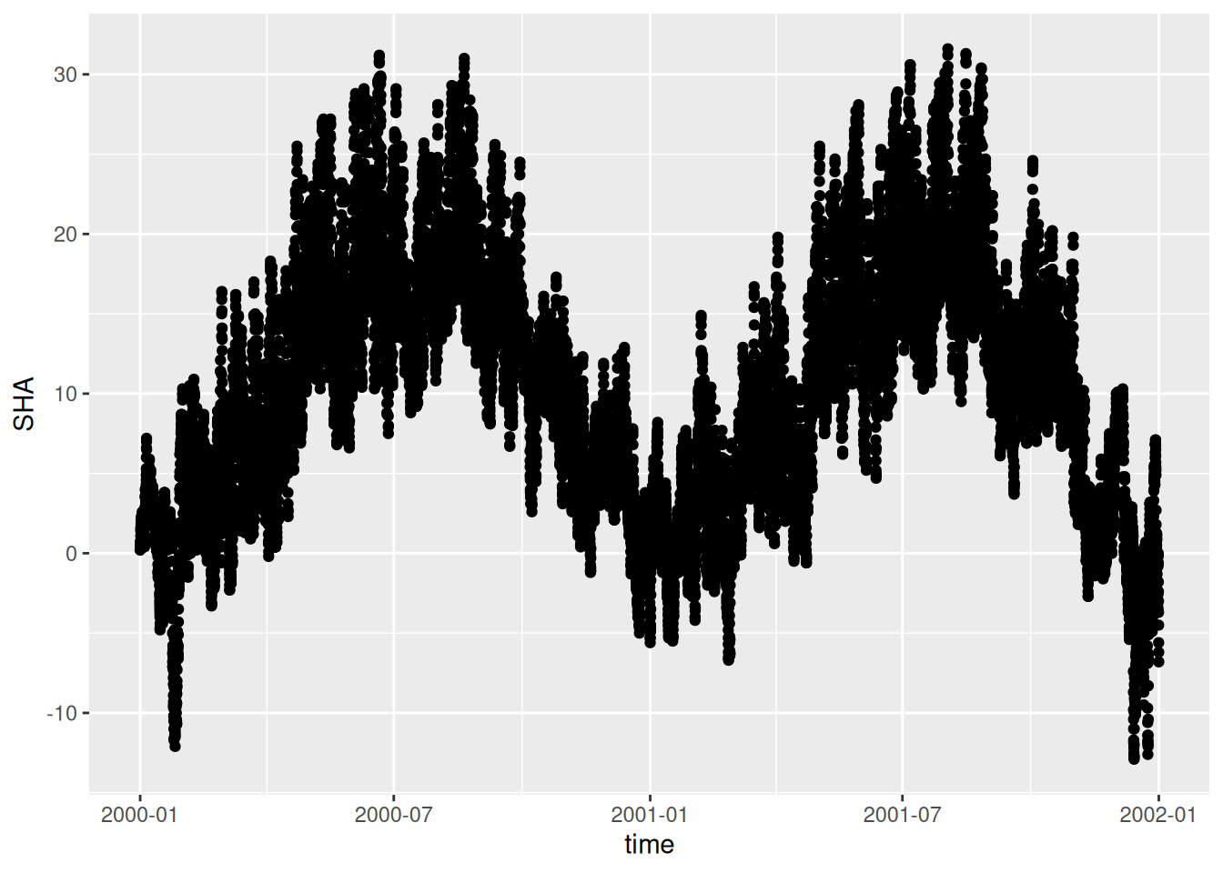
Since inputs are expected in the order of data = followed by mapping = in ggplot, we can omit these specifications.
ggplot(temperature, aes(time, SHA)) +
  geom_point()
Long vs. wide
As mentioned in PrePro 2, ggplot2 is designed for long tables. Therefore, we need to transform the wide table into a long format:
temperature_long <- pivot_longer(temperature, -time, names_to = "station", values_to = "temp")To colour-code different weather stations, we define variables that will influence the graphic, which are incorporated in the aes() function:
ggplot(temperature_long, aes(time, temp, colour = station)) +
  geom_point()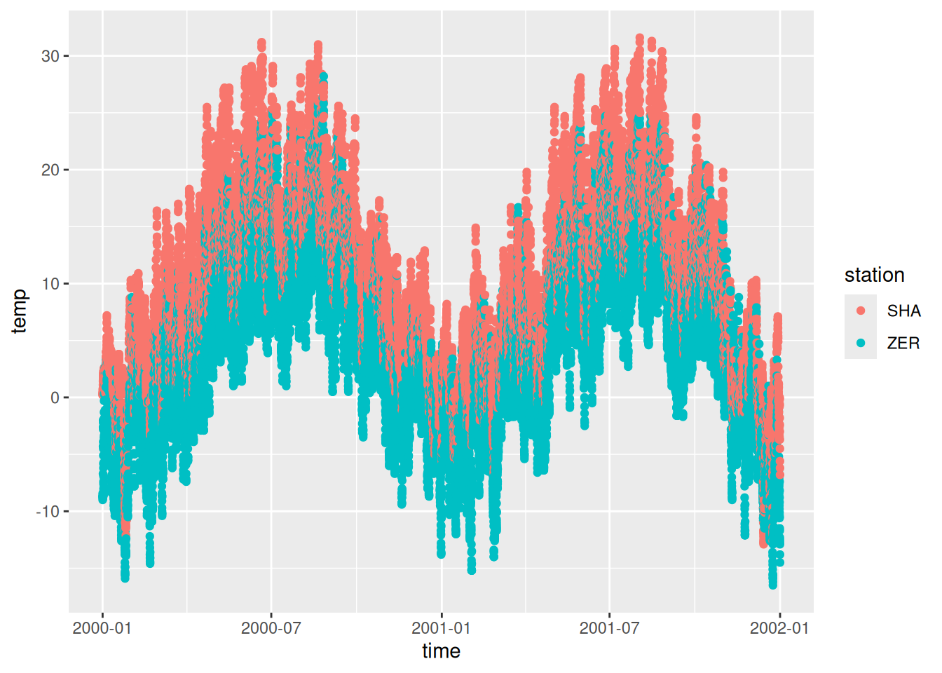
We can also add additional layers with lines:
ggplot(temperature_long, aes(time, temp, colour = station)) +
  geom_point() +
  geom_line()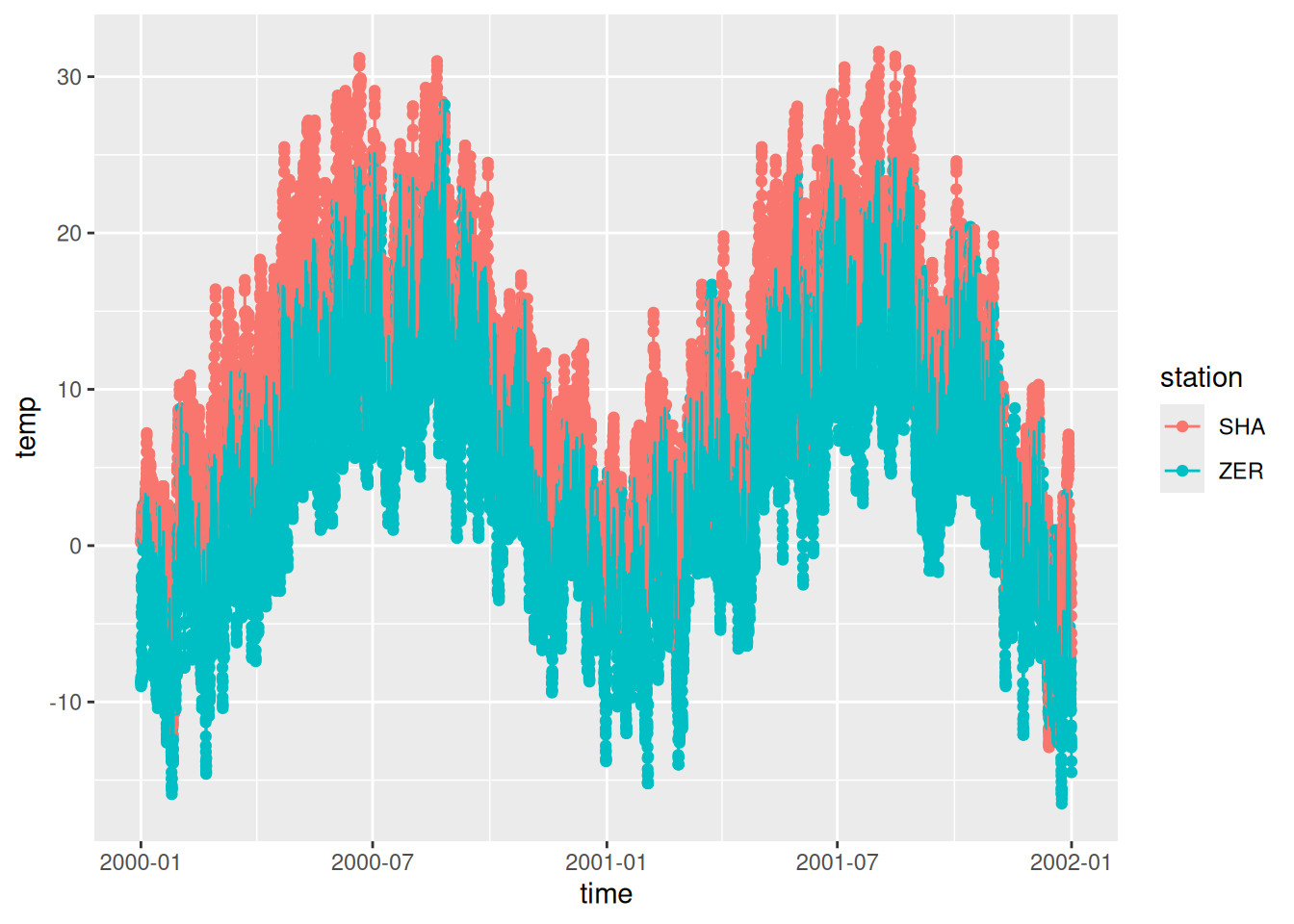
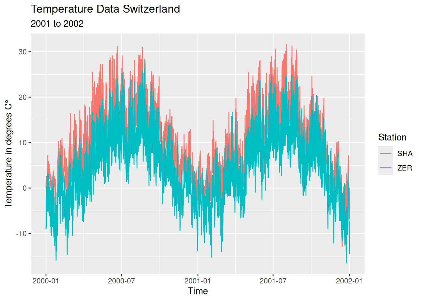
Labels
Next, we’ll refine our plot by adding axis labels and a title. Additionally, we’ve chosen to remove the points (geom_point()) as they don’t align with my preferred visualisation style.
ggplot(temperature_long, aes(time, temp, colour = station)) +
  geom_line() +
  labs(
    x = "Time",
    y = "Temperature in degrees C°",
    title = "Temperature Data Switzerland",
    subtitle = "2001 to 2002",
    colour = "Station"
  )
Split Apply Combine
In our plot, the hourly data points are too detailed for a two-year visualisation. Using the Split Apply Combine technique (covered in PrePro 3), we can adjust the data resolution:
temperature_day <- temperature_long |>
  mutate(time = as.Date(time))

temperature_day
# A tibble: 35,088 × 3
time station temp
<date> <chr> <dbl>
1 2000-01-01 SHA 0.2
2 2000-01-01 ZER -8.8
3 2000-01-01 SHA 0.3
4 2000-01-01 ZER -8.7
5 2000-01-01 SHA 0.3
6 2000-01-01 ZER -9
7 2000-01-01 SHA 0.3
8 2000-01-01 ZER -8.7
9 2000-01-01 SHA 0.4
10 2000-01-01 ZER -8.5
# ℹ 35,078 more rowstemperature_day <- temperature_day |>
group_by(station, time) |>
summarise(temp = mean(temp))
temperature_day# A tibble: 1,462 × 3
# Groups: station [2]
station time temp
<chr> <date> <dbl>
1 SHA 2000-01-01 1.25
2 SHA 2000-01-02 1.73
3 SHA 2000-01-03 1.59
4 SHA 2000-01-04 1.78
5 SHA 2000-01-05 4.66
6 SHA 2000-01-06 3.49
7 SHA 2000-01-07 3.87
8 SHA 2000-01-08 3.28
9 SHA 2000-01-09 3.24
10 SHA 2000-01-10 3.24
# ℹ 1,452 more rowsAdjusting the X/Y Axes
You can also influence the x/y axes. You first have to determine what type of axis the plot has (in its default setting, ggplot automatically selects the axis type based on the nature of the data).
For our y-axis, which consists of numerical data, ggplot uses scale_y_continuous(). Other axis types can be found at ggplot2.tidyverse.org (scale_x_something or scale_y_something).
ggplot(temperature_day, aes(time, temp, colour = station)) +
  geom_line() +
  labs(
    x = "Time",
    y = "Temperature in degrees C",
    title = "Temperature Data Switzerland",
    subtitle = "2001 to 2002",
    color = "Station"
  ) +
  scale_y_continuous(limits = c(-30, 30)) # determine y-axis section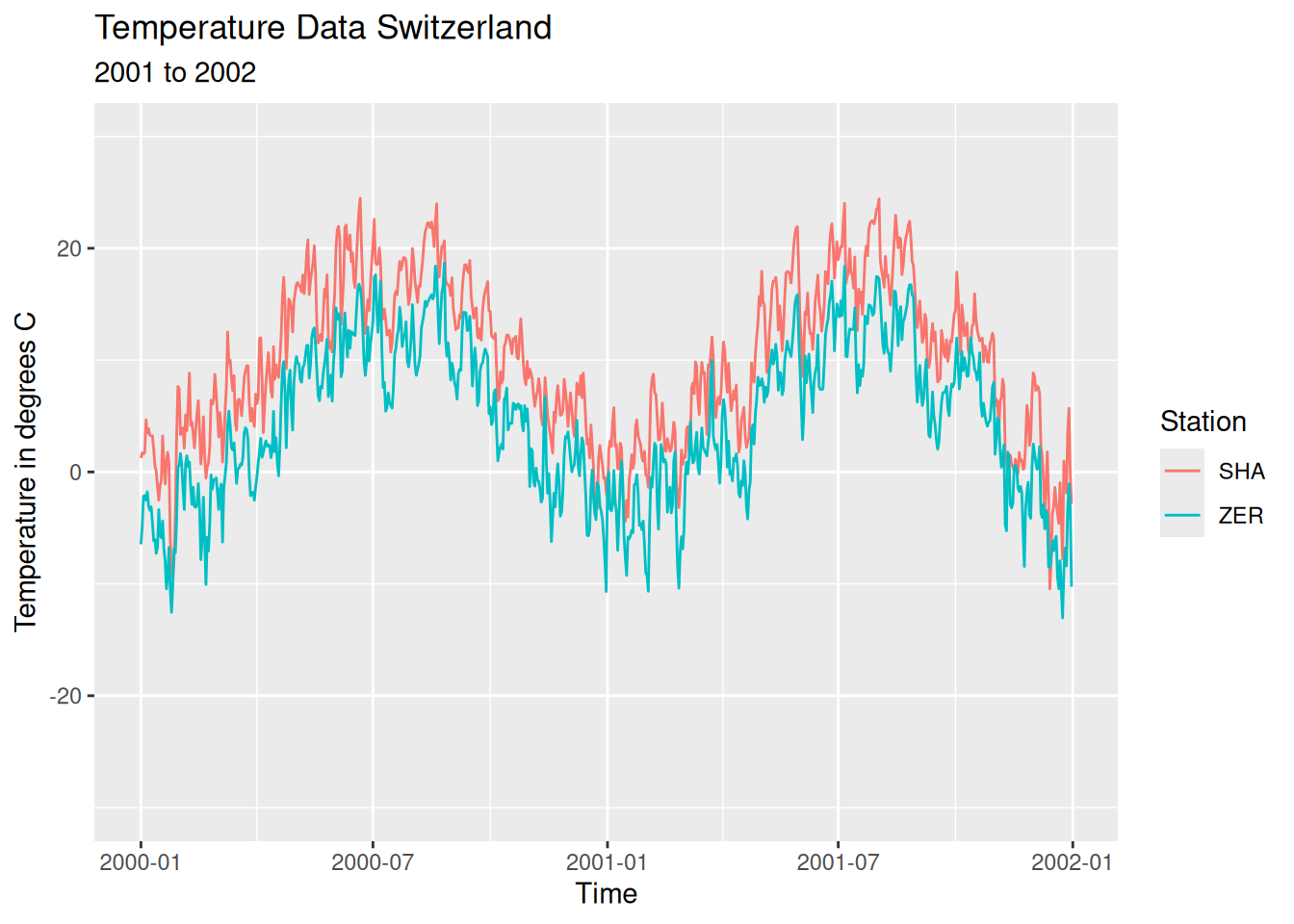
This can also be done for the x-axis. Our x-axis consists of date information. ggplot calls this: scale_x_date().
ggplot(temperature_day, aes(time, temp, colour = station)) +
  geom_line() +
  labs(
    x = "Time",
    y = "Temperature in degrees C",
    title = "Temperature Data Switzerland",
    subtitle = "2001 to 2002",
    color = "Station"
  ) +
  scale_y_continuous(limits = c(-30, 30)) +
  scale_x_date(
    date_breaks = "3 months",
    date_labels = "%b"
  )
Customising Themes
The theme function in ggplot allows us to alter the general layout of plots. For instance, theme_classic() changes the plot’s style to a more traditional look, which is ideal for formal reports or publications. This theme can be applied either to individual plots or set as a default for all plots within a session.
Applying to a single Plot:
ggplot(temperature_day, aes(time, temp, colour = station)) +
  geom_line() +
  theme_classic()
Global setting (for all subsequent plots in the current session):
theme_set(theme_classic())Facets / Small Multiples
ggplot also offers powerful functions for creating “Small multiples” using facet_wrap() (or facet_grid(), more on this later). These functions divide the main plot into smaller subplots based on a specified variable, denoted by the tilde symbol “~”.
ggplot(temperature_day, aes(time, temp, colour = station)) +
  geom_line() +
  labs(
    x = "Time",
    y = "Temperature in °C",
    title = "Temperature Data of Switzerland",
    subtitle = "2001 to 2002",
    colour = "Station"
  ) +
  scale_y_continuous(limits = c(-30, 30)) +
  scale_x_date(
    date_breaks = "3 months",
    date_labels = "%b"
  ) +
  facet_wrap(~station)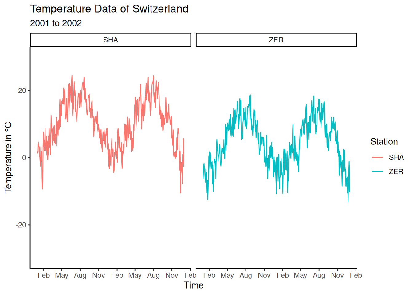
facet_wrap can also be customised further, such as by setting the number of facets per row with ncol =.
In addition, since the station names are displayed above each facet, we no longer require the legend. This is achieved with theme(legend.position="none").
ggplot(temperature_day, aes(time, temp, colour = station)) +
  geom_line() +
  labs(
    x = "Time",
    y = "Temperature in °C",
    title = "Temperature Data of Switzerland",
    subtitle = "2001 to 2002"
  ) +
  scale_y_continuous(limits = c(-30, 30)) +
  scale_x_date(
    date_breaks = "3 months",
    date_labels = "%b"
  ) +
  facet_wrap(~station, ncol = 1) +
  theme(legend.position = "none")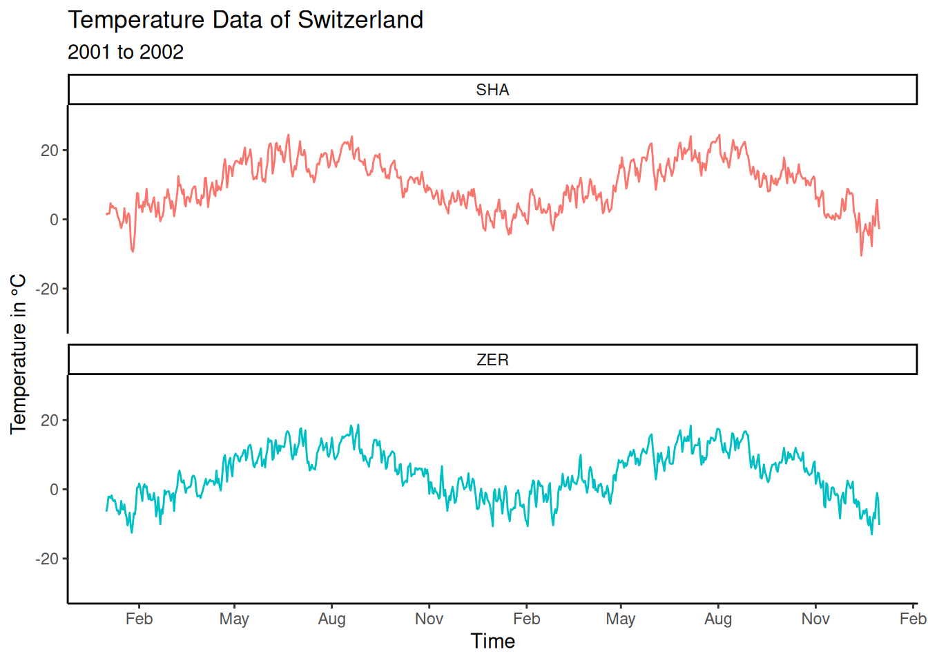
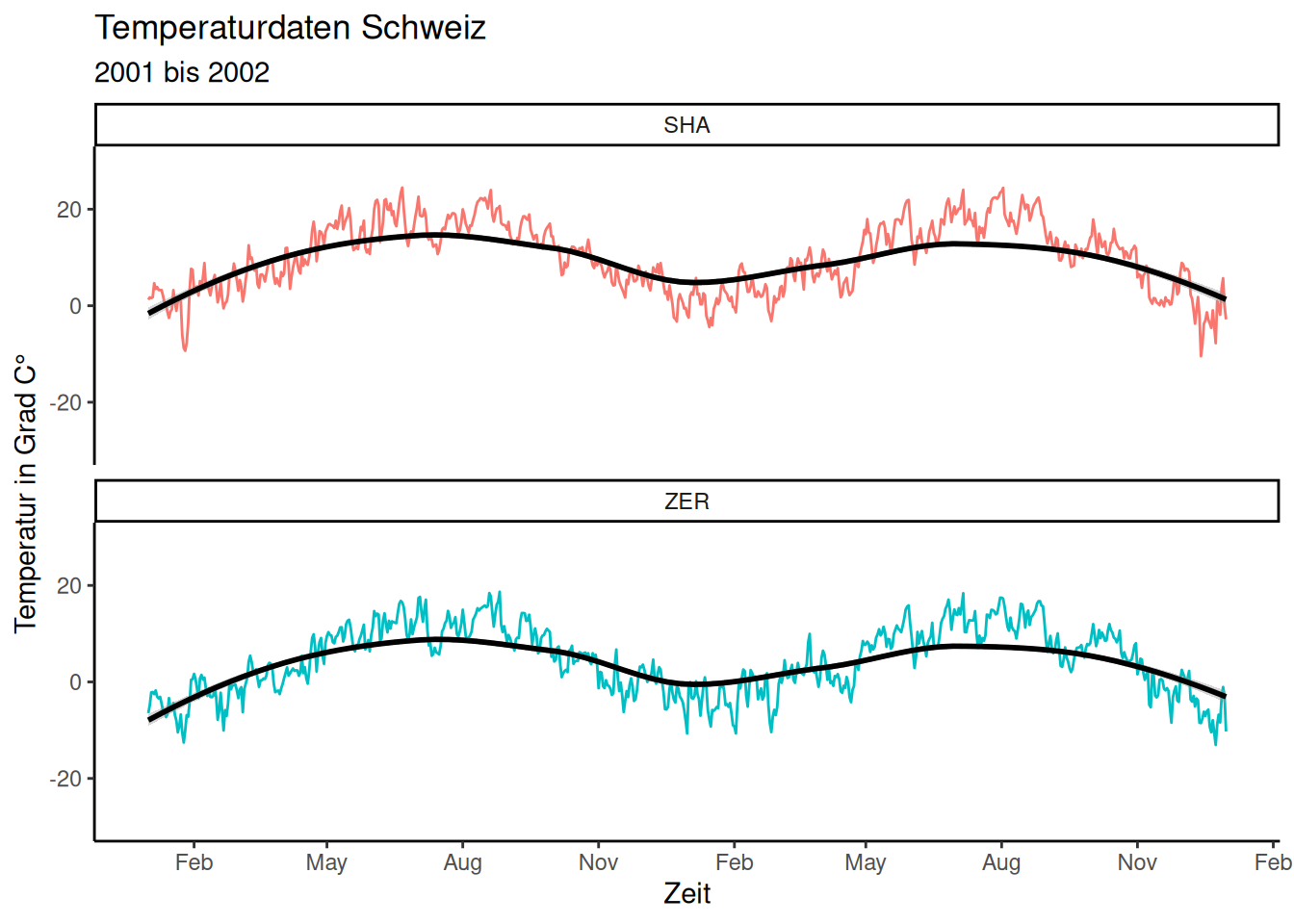
Storing and Exporting Plots
Like data.frames and other objects, a complete ggplot plot can be stored in a variable. This is useful for exporting the plot (as PNG, JPG, etc.) or for progressively enhancing it, as shown in this example.
p <- ggplot(temperature_day, aes(time, temp, colour = station)) +
  geom_line() +
  labs(
    x = "Zeit",
    y = "Temperatur in Grad C°",
    title = "Temperaturdaten Schweiz",
    subtitle = "2001 bis 2002"
  ) +
  scale_y_continuous(limits = c(-30, 30)) +
  scale_x_date(
    date_breaks = "3 months",
    date_labels = "%b"
  ) +
  facet_wrap(~station, ncol = 1)
# At this point, theme(legend.position="none") was removed
To save the plot as a PNG file (without specifying “plot =”, the last plot is simply saved):
ggsave(filename = "plot.png", plot = p)To add a layer or option to an existing plot stored in a variable:
p +
  theme(legend.position = "none")
As is typical with R, the modification made to the plot is not automatically saved; it only shows the outcome of the change. To permanently incorporate this change into my plot stored in the variable, we need to overwrite the variable with the updated plot:
p <- p +
  theme(legend.position = "none")
Smoothing
The geom_smooth() function in ggplot can add trend lines to scatter plots. It is possible to select the underlying statistical method that is applied, yet by default, for datasets with fewer than 1,000 observations, ggplot defaults to using the stats::loess method. For larger datasets, it switches to mgcv::gam.
p <- p +
  geom_smooth(colour = "black")
p