library("dplyr")
library("ggplot2")
library("readr")

canton <- read_delim("datasets/infovis/tagi_data_kantone.csv", ",")Infovis 1: Exercise
This exercise involves recreating the graphics from the Kovic (2014) blog post. Since the original blog post is no longer available, we’ve hosted a copy on the following website:
https://researchmethods-zhaw.github.io/blog.tagesanzeiger.ch/
Please review the graphics in the blog post. The default settings for ggplot2 were used in the blog post, which makes recreating the graphics easier. The links in the text refer to the original graphics, while the embedded plots have been recreated.
First, let’s import the dataset tagi_data_kanton.csv.
Task 1
Your first task is to recreate the following plot from Kovic (2014) using ggplot and the tagi_data_kanton.csv dataset:
Here’s are some tips to get you started:
- Create a
ggplotobject withggplot(canton, aes(auslanderanteil, ja_anteil)), then add a point layer withgeom_point(). - Use
coord_fixed()to set a fixed ratio (1:1) between the axes. - Optionally, you can:
- Set the axis limits with
scale_x_continuous(orscale_y_continuous). - Manually set the
breaks(0.0,0.10.3etc) withinscale_x_continuous(orscale_y_continuous) - Use
labs()to label the axes.
- Set the axis limits with
Sample Solution
# Solution to Task 1

plot1 <- ggplot(canton, aes(auslanderanteil, ja_anteil)) +
  geom_point() +
  coord_fixed(1) +
  scale_y_continuous(breaks = c(0, 0.1, 0.3, 0.5, 0.7), limits = c(0, 0.7)) +
  scale_x_continuous(breaks = c(0, 0.1, 0.3, 0.5, 0.7), limits = c(0, 0.7)) +
  labs(y = "Proportion of Yes Votes", x = "Foreigner Proportion")

plot1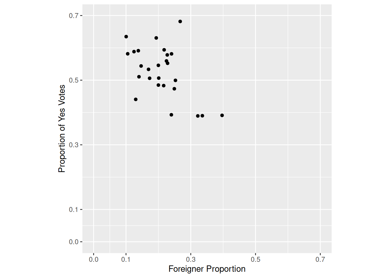
Task 2
Next, replicate the following plot from Kovic (2014) using ggplot:
Here’s a tip:
- Use
geom_smooth.
Sample Solution
# Solution to Task 2

plot1 +
  geom_smooth()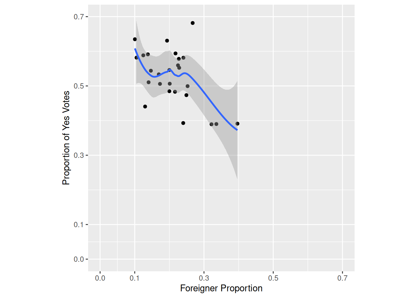
Task 3
Now, let’s import the municipal data tagi_data_gemeinden.csv.
Replicate the following plot from Kovic (2014) using ggplot and the tagi_data_gemeinden.csv dataset:
Here are some tips:
- Use
geom_point(). - Use
labs(). - Use
coord_fixed().
Sample Solution
# Solution to Task 3

municipality <- read_delim("datasets/infovis/tagi_data_gemeinden.csv", ",")

plot2 <- ggplot(municipality, aes(anteil_ausl, anteil_ja)) +
  geom_point() +
  labs(x = "Foreigner Proportion", y = "Proportion of Yes Votes") +
  coord_fixed(1) +
  lims(x = c(0, 1), y = c(0, 1))

plot2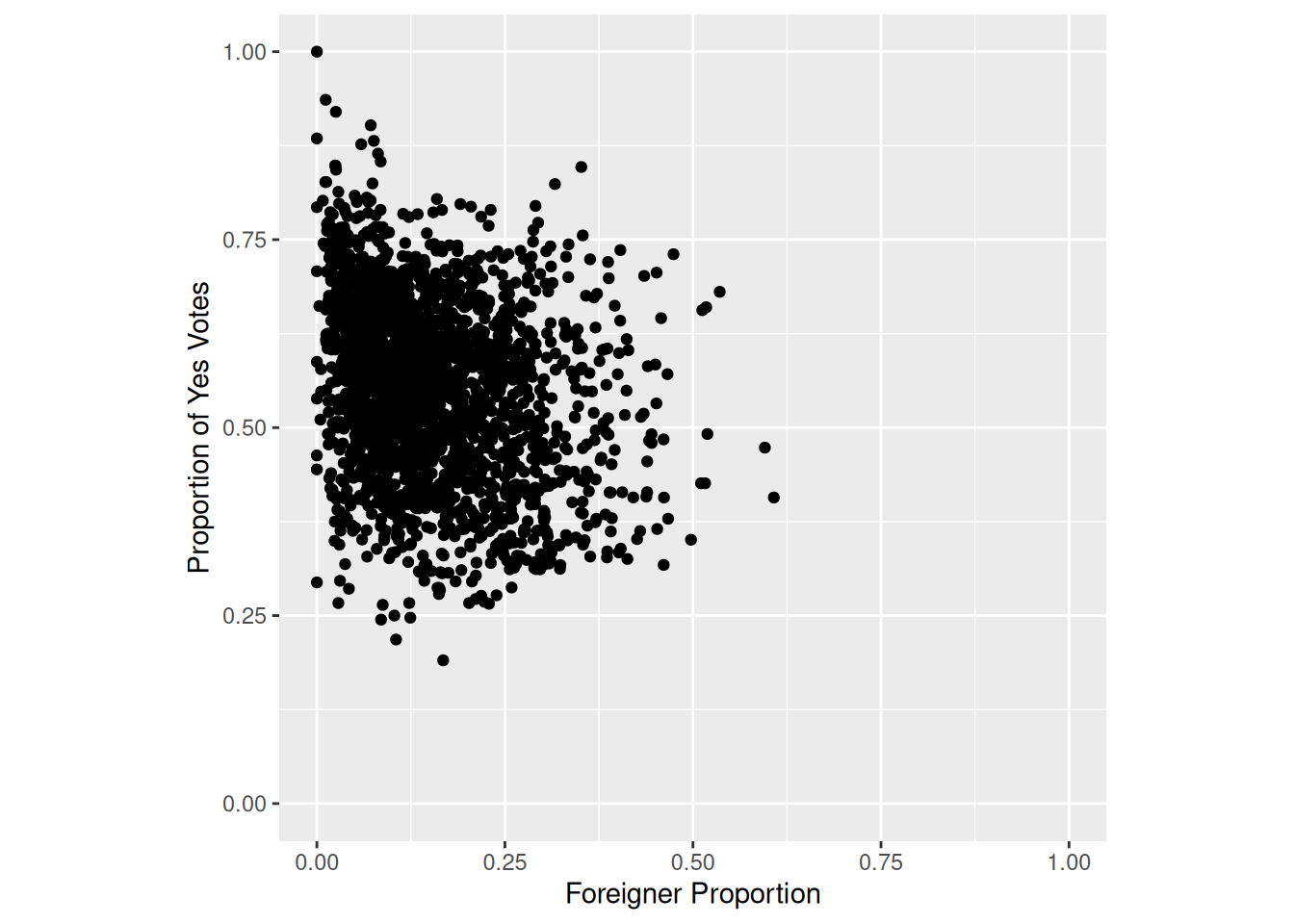
Task 4
Replicate the following plot from Kovic (2014) using ggplot and the tagi_data_gemeinden.csv dataset:
Here’s a tip:
- Use
geom_smooth.
Sample Solution
# Solution to Task 4

plot2 +
  geom_smooth()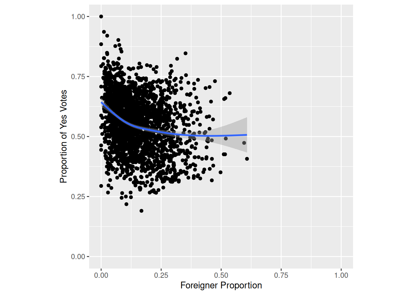
Task 5
Replicate the following plot from Kovic (2014) using ggplot and the tagi_data_gemeinden.csv dataset:
Here’s a tip:
- Use
facet_wrapto display a separate plot for each canton.
Sample Solution
# Solution to Task 5

plot3 <- plot2 +
  facet_wrap(~kanton)
plot3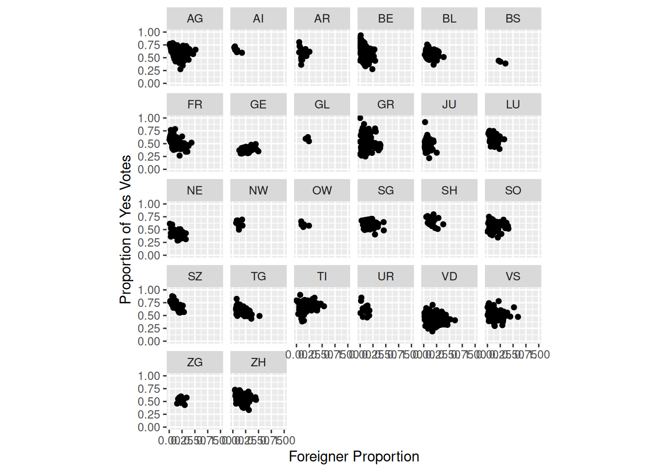
Task 6
Replicate the following plot from Kovic (2014) using ggplot and the tagi_data_gemeinden.csv dataset:
Here’s a tip:
- Use
geom_smooth.
Sample Solution
# Solution to Task 6

plot3 +
  geom_smooth()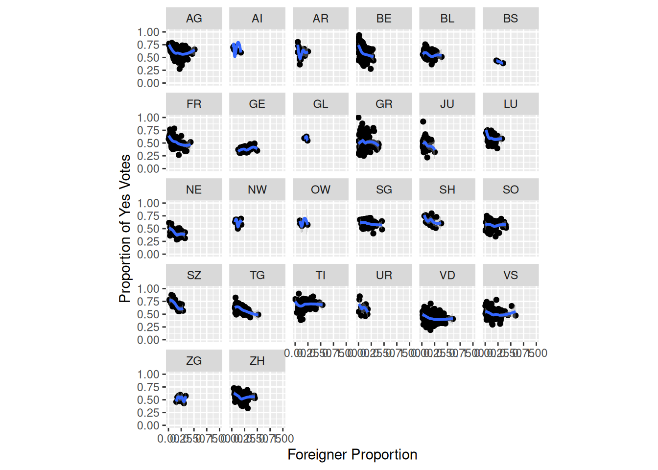
Task 7
Replicate the following plot from Kovic (2014) using ggplot and the tagi_data_gemeinden.csv dataset:
Here’s a tip:
- Use
facet_wrap
Sample Solution
# Solution to Task 7

plot4 <- plot2 +
  facet_wrap(~quantile)
plot4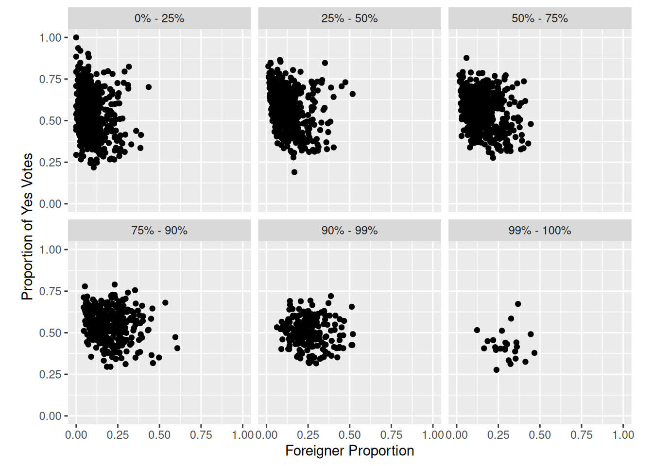
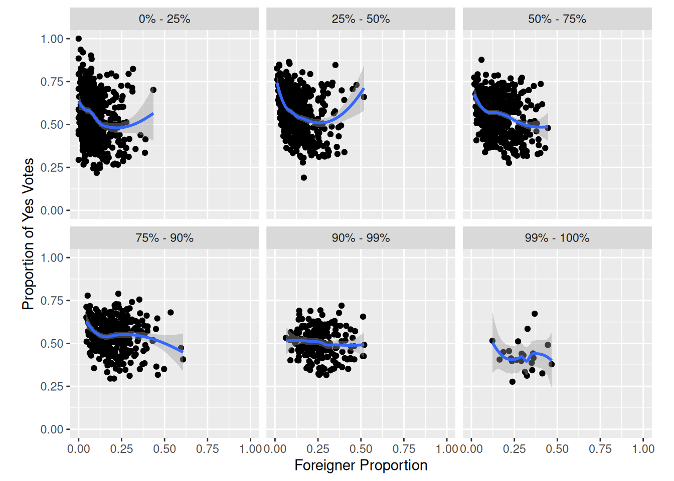
Task 8
Replicate the following plot from Kovic (2014) using ggplot and the tagi_data_gemeinden.csv dataset:
Here’s a tip:
- Use
geom_smooth.
Sample Solution
# Solution to Task 8

plot4 +
  geom_smooth()